
Hubwell
Client
Hubwell
Category
Branding
Year
2026
01
The Challenge
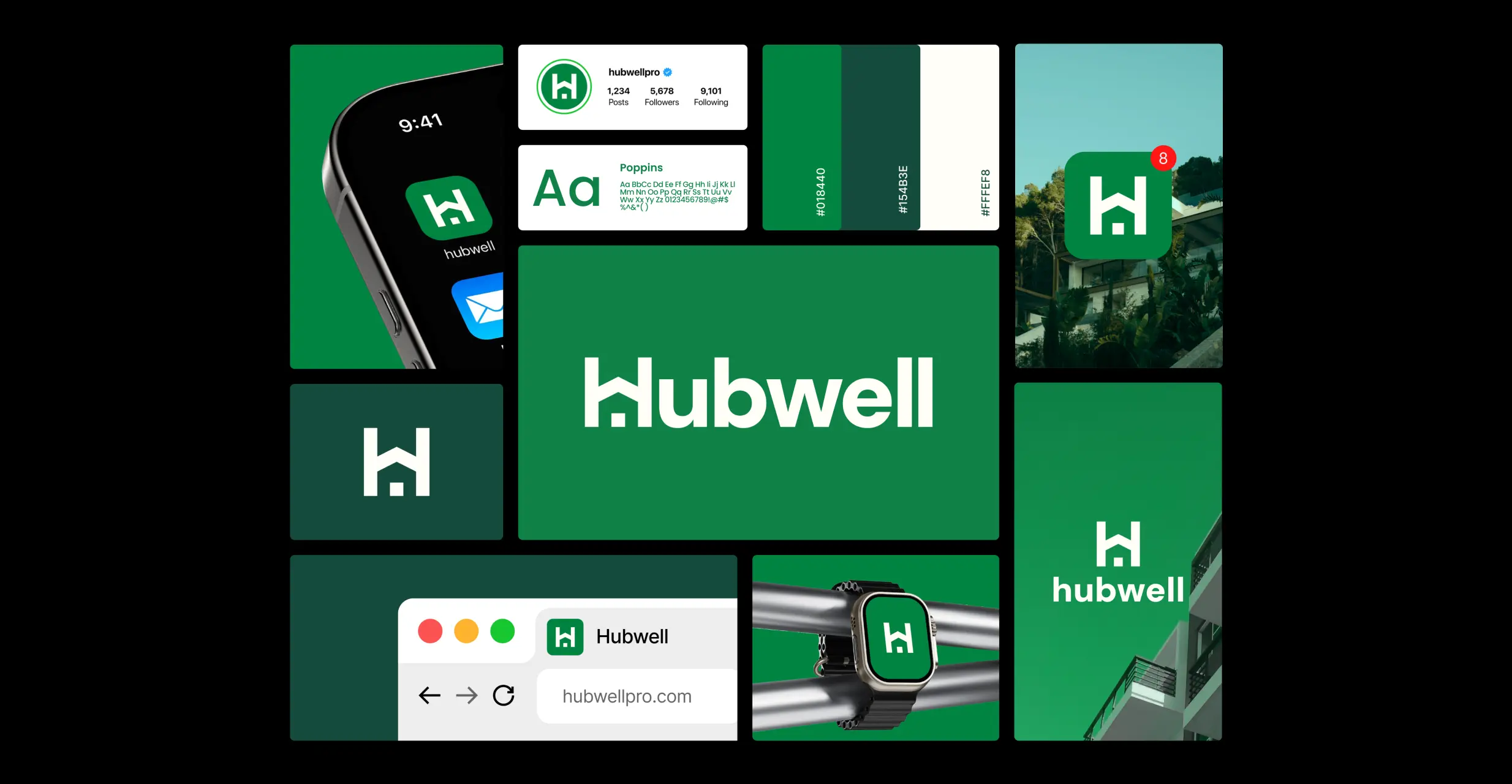
Hubwell is a premium real estate accompaniment firm based in Marrakech, guiding high net worth clients through the construction of luxury villas. The brand needed to hold two qualities at once: the warmth of a trusted human partner, and the rigor of a premium institution. Most real estate brands lean fully into one or the other, so Hubwell risked feeling either cold and corporate or soft and forgettable.
02
The Approach
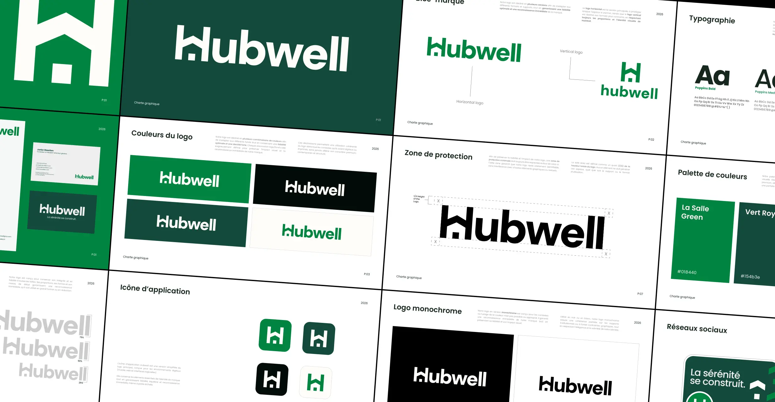
The identity was built around a single idea: serenity is constructed, not promised. The wordmark merges the letter H with the silhouette of a house, while quietly forming the shape of a W to signal stability and protection. The palette stays deliberately restrained, with La Salle Green as the signature color, Vert Royal for institutional weight, and Ceramic for approachability. Poppins carries the whole system across three weights, keeping the brand premium without ever feeling stiff.
03
The Outcome
The result is a complete brand identity and a guidelines document covering logo usage, safe zones, color application, social media templates, stationery, and app iconography. Every touchpoint now reads as the same confident, calm institution, giving Hubwell a presence that matches the level of client it was built to serve.

Next Project